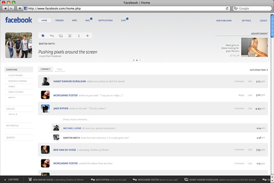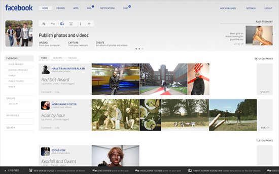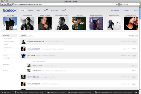
Facebook has had the same basic design for at least a few years now. There have been small changes along the way, but for the most part, the last few years for Facebook have remained pretty standard — news feed, images and link sharing. Some might say if it ain’t broke, don’t fix it, but artist Barton Smith is under the impression that the social network needs an entire facelift, let alone an update.
Smith took it upon himself to redesign Facebook’s UI, imagining a site with a slick UI, compared to the current site built around the minimalist news feed.


 Gearfuse Technology, Science, Culture & More


Don’t tell me it’s gonna be all flash, that’d just destroy the whole website.
why does everybody use mac, they suck ass.
If facebook uses the UI i am NOT going to use facebook. That looks so stupid!