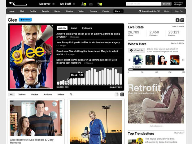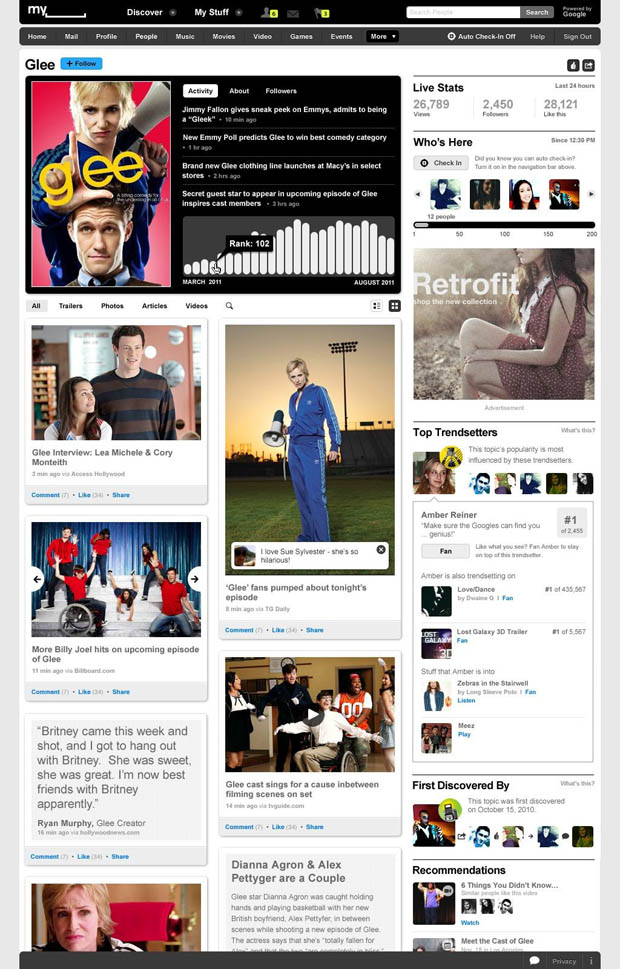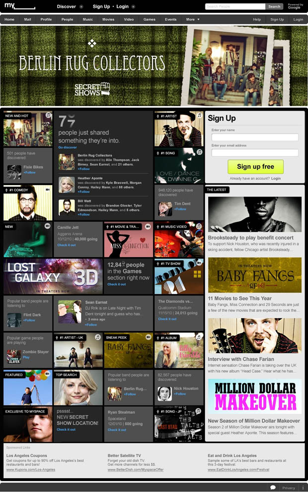
We knew that MySpace had a new redesign in the works, and their redesigned logo ruffled a few feathers, but their newly revealed redesign has garnered some positive reviews from the web community. MySpace appears to be aiming at distinguishing themselves as the music/video/media sharing answer to Facebook’s TMI status-sharing privacy-crushing wall-updating ways.
Topic pages will provide stylized aggregations of popular and interesting articles across the web. The new home page will broadcast real-time articles of interest as they pop up around the web. Oh, and you’ll be able to share stuff too. Also, the new logo has been slightly normalized by adding the word Space back to the design, rather than just the space symbol. Check out the full page previews after the jump.


Link
 Gearfuse Technology, Science, Culture & More


