 Gearfuse Technology, Science, Culture & More
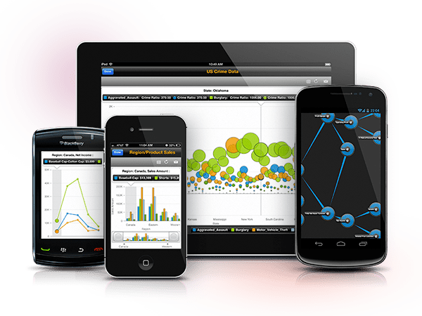
For many businesses with an online presence, analytics are a key part of their campaigns. Analytics often do not make a distinction between users coming from a laptop/desktop environment and a mobile environment. When a company is designing their online presence and looking for a web analytical tool, it is worth making sure that analytical tools are in place to measure mobile users as well. This can be a critical tool in making sure a website is optimized for the greatest consumption for viewers. Mobile analytics allows for a greater amount of distinction between the mobile and laptop/desktop web consumption. Allowing for better optimization.

Mobile Markets
Zoe Fox wrote an article for mashable.com in August that showed mobile devices accounted for 17.4 percent of Internet usage. A percentage that high is great enough that ignoring the mobile market when designing a website would be to the peril of the company. The best use of web design for the mobile market is through responsive web design. Responsive web design allows the web designer to write the website once, and have it adapt to the type of device it is being consumed on. Using web analytics for the mobile market combined with responsive mobile design means a greater amount of optimization and ultimately traffic.
Designing for Mobile Markets
As previously mentioned, when designing for the mobile market, it is best to utilize responsive web design. Mobile website analytics is a crucial part of figuring out what demographics a website is being seen by. When designing a website, content and flow needs to be well thought out. Web analytics will help in a couple of ways when deciding how to set up a site for the mobile market. The prime way that analytical tools will do this, is by providing you with the knowledge of exactly what devices are being used to view a given site. For example, if the primary mobile web viewers are iPad, or tablet users, then a company knows to gear their mobile site for these types of devices. If the analytical tools tell the tale of smartphones primarily being used to view the website, then a company can take that information to optimize the mobile site for smart phones.
The website Web Credible offers a variety of tips on how to optimize web design for mobile markets. One of the main tips is to limit content. By this Web Credible means, make sure that the site is not cluttered with information and pictures. Viewers are not able to properly look at a lot of information on a mobile platform like they are on traditional laptops and desktops. In addition to quantity of content, it is a good idea to make sure that the website is created in a single column layout. This reduces the amount of scrolling that a user has to do on their mobile platform. Analytical tools for mobile websites will likely validate these tips, and will help any company.

