If you’re looking for inspiration from top-notch UX, check out fashion websites. They often feature the most intuitive navigation, stylish design choices, and killer sales funnels.
Here’s a curated list of the top 5 fashion ecommerce websites with outstanding UX, handpicked by a professional website design agency.
Net-a-porter
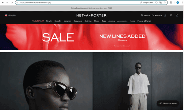
The page looks clean, stylish, and uncluttered, doesn’t it?
But take a closer look, and you’ll see it’s packed with information.
You probably first noticed the bold sale banner — that’s exactly what the designers intended! Right there, a “Shop Now” button lets you jump straight to the discounted offers.
Now, check out the slim gray bar at the top about free shipping. It’s minimalist but catches your eye, even peripherally, because the text moves: two offers alternate every few seconds.
Also, notice the Rewards button near the user account. It instantly signals that the brand plays the long game, rewarding loyal customers.
With just a few elements, the brand communicates its offers and values. Smart!
SKIMS

SKIMS could teach a masterclass on product page design. It seems to have everything a user needs to make a decision: a size chart with available and sold-out sizes, details about fabric and fit, shipping and return info, and even an incentive to use free returns if you download their app. Friendly advice: if you ever turn to a clothing website design agency, show such product cards as a reference.
In the photo gallery, the model shows the dress from every angle, and there’s even a macro shot of the fabric, revealing the weave of the threads.
Plus, right on the product page, you see multiple payment options, including installment plans. Despite all this, the page feels airy and not overwhelming.
Patagonia
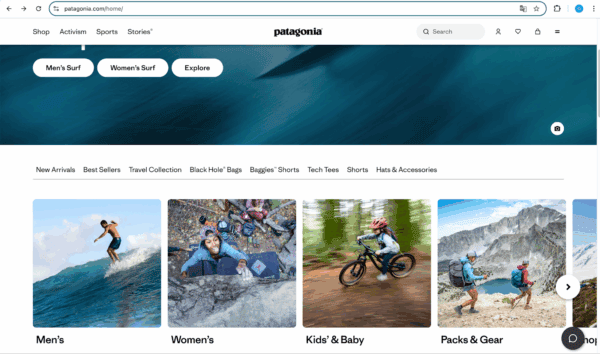
Patagonia’s website stands out with its strong visual storytelling. Notice the photos: they show products in action, worn by people who feel “real” and relatable, like you and me.
Another strength is the filters right on the homepage. Check out the screenshot: beyond the standard “Men’s,” “Women’s,” and “Kids’,” there are categories like Black Hole Bags, Baggy Shorts, and more — likely their most popular items right now.
And — though not visible in the screenshot — if you scroll further, the homepage essentially turns into a portal to other site categories. But the focus isn’t just on products; it’s on the activities they’re made for. Sections are named things like Built to Ride, Climbing, Fly Fishing, and Trail Running. It feels like they’re not just selling you stuff but inviting you into a lifestyle.
Lululemon
The hero image features a brand ambassador who’s a fitness instructor and mental health advocate. From the first second, it’s like Lululemon is saying, “Pros trust us.”
Then, there’s a small “Feedback” button on the right side of the screen, mid-page. Click it, and you can rate your site experience or leave open-ended feedback. It screams openness and a desire to hear from customers, doesn’t it?
Also, at the top, they offer a discount for signing up. You can shop as a guest, but the site gently nudges you toward registering — it’s a win-win. You get a bonus, and the brand gets an email for personalized offers later.
Sézane
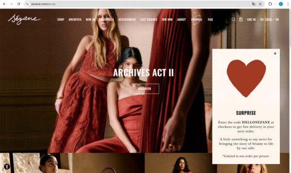
Sézane’s page might surprise you with its lack of discount or sale banners. There’s just a subtle offer for a free shipping promo code.
Yet, the site’s design and overall vibe hint at a deeper story — and there is one.
Look at the About button, styled in italics to draw your eye. Click it, and you’ll learn the brand stands for quality, fair pricing, and conscious consumption. They deliberately avoid sales and overstock to prevent overproduction.
Instead, twice a year, they release “archives” (there’s the clue to the cryptic Archives Act II label) — unsold items at reduced prices to ensure each piece finds a home.
Pretty cool concept and beautifully executed, right?
As you can see, excellent UX isn’t just about “convenience” and technical aspects (like fast loading times, mobile optimization, or a stable website). It’s also about aesthetics: responsive design, clear visual hierarchy, and minimal cognitive load.
Moreover, it’s about the feelings a user takes away from the site. Do they feel trust? Do they sense that their needs were considered? Did they get enough information to make a decision?
Implementing these elements will help you convey your idea to customers more effectively and foster their loyalty to your brand.